Pho Than Brothers
Mock Re-Brand Guide Book
Timeline: 12 Weeks
My Roles: Branding, Layout, Art Direction
Teammate: Minjung Yoon
Tools: InDesign, Illustrator, XD, Photoshop
Current Branding


Background
—
Founded in 1996 along Aurora Avenue in North Seattle, Pho Than Brothers quickly became a neighborhood favorite—introducing authentic Vietnamese pho and their signature cream puffs to a city just beginning to discover Southeast Asian cuisine. What started as a single family-run restaurant soon expanded into multiple locations across the Seattle area, each carrying the same sense of warmth, comfort, and community.
As Seattle’s dining scene evolved and new eateries emerged, the brand faced a pivotal moment: to refresh its identity while honoring its legacy. The rebrand sought to modernize the visual system, unify the restaurant’s expanding presence, and capture the spirit that has made Pho Than Brothers a Seattle staple for nearly three decades—familiar, honest, and effortlessly welcoming.
Goals
—
The goal of this rebrand was to capture the authentic, approachable spirit of Pho Than Brothers while introducing a visual system that feels contemporary, cohesive, and true to the brand’s roots. With multiple locations across Seattle, the identity needed to unify the restaurant’s presence while honoring its legacy as one of the city’s original pho establishments.
The design direction centered on modern simplicity grounded in heritage—balancing familiarity with freshness. The new identity celebrates the brand’s longevity and deep connection to Seattle’s food culture, positioning Pho Than Brothers as both a timeless neighborhood staple and a standout in a growing culinary landscape.
Creative Direction
—
The rebrand began with a simple but important question: Who is Pho Than Brothers today—and who are they not?
To capture the heart of the brand, we immersed ourselves in its history, community, and personality. Through research, observation, and conversation, we uncovered what makes Than Brothers truly special: the warmth of family tradition, the familiarity of comfort food, and the casual ease of a neighborhood gathering place.
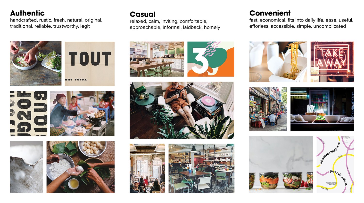
Our visual direction was guided by three core attributes that define the brand’s essence. Using mood boards and visual mapping exercises, we built a spectrum from “Who We Are” to “Who We Are Not”—a process that helped us refine the tone and visual identity.
As a team, we conducted a collaborative visual mapping exercise to define the brand’s tonal direction. Each team member used a distinct color to mark images that best represented Pho Than Brothers’ personality and atmosphere. The images with the most selections advanced to the next round—categorized under “Who We Are” and “Who We Are Not.” This method helped us align visually and conceptually, ensuring that the brand’s new identity reflected a shared understanding of its authentic tone and character.
The tagline “Momma’s Comfort in a Bowl” emerged from this exploration, honoring the family recipe and matriarchal story behind the restaurant’s success. It became the emotional anchor of the brand—capturing the sense of nostalgia and care that generations of Seattleites associate with Pho Than Brothers.
Process and approach
—
Our process began with brand discovery and research—analyzing Pho Than Brothers’ history, visual presence, and position within Seattle’s competitive restaurant scene. We conducted on-site visits to their Capitol Hill location, immersing ourselves in the restaurant’s atmosphere and speaking directly with employees and managers.
We asked three key questions to inform our strategy:
Who are the typical patrons who dine here?
Are the interiors and exteriors consistent across locations?
How is the brand represented through employee attire and in-store materials?
The answers revealed a consistent theme of familiarity, warmth, and community—values that shaped the brand’s new direction. From there, we defined a visual identity system built around clean typography, a warm and approachable color palette, and versatile applications across menus, packaging, signage, and digital media.
The result is a refreshed identity that honors Pho Than Brothers’ long-standing legacy while giving it the tools to grow and evolve with Seattle’s ever-changing dining landscape.

As a team, we conducted a collaborative visual mapping exercise to define the brand’s tonal direction. Each team member used a distinct color to mark images that best represented Pho Than Brothers’ personality and atmosphere. The images with the most selections advanced to the next round—categorized under “Who We Are” and “Who We Are Not.” This method helped us align visually and conceptually, ensuring that the brand’s new identity reflected a shared understanding of its authentic tone and character.

Continued dot session

On the whiteboard, we divided the spectrum with “Who We Are” on the left and “Who We Are Not” on the right. Images with the most colored dots were placed in the “Who We Are” section, while those with fewer dots were moved to the opposite side. This visual sorting exercise helped the team define the brand’s tonal territories—our recipe for capturing the authentic essence of Pho Than Brothers and guiding the creative direction moving forward.

As we refined our image selections, we held a follow-up brainstorming session to translate the visuals into language. From this discussion, three words consistently surfaced—Authentic, Casual, and Convenient. These became the core brand attributes that shaped our design direction, guiding every visual and verbal decision throughout the rebrand.
Brand Concept
—
The brand concept merges authenticity and casual warmth to reflect the true spirit of Pho Than Brothers. Drawing inspiration from the worn textures of old buildings, hand-painted signage, and everyday neighborhood details, the visual identity celebrates the brand’s 26-year legacy while introducing a refined sense of familiarity. These subtle textures and tonal cues evoke the feeling of a place that’s been part of the community for decades—honest, enduring, and effortlessly inviting.

Brand Colors
—
The color palette embodies the casual warmth and approachability of Pho Than Brothers. A vibrant orange conveys energy and hospitality, while a soft, warm blue adds balance and calm. These tones are grounded by a light cream accent, reflecting the brand’s welcoming atmosphere and timeless comfort—colors that feel as familiar and inviting as a bowl of pho shared among friends.

Brand Mark & Color system
—
The Pho Than Brothers logo was designed to capture the authentic quality and handcrafted character of the restaurant. The hand-drawn typography, set against an organic, rough-edged rectangle, reflects the brand’s approachable and imperfect charm—rooted in family tradition and everyday authenticity.
The letterforms in “PHO” feature subtle stems that reference noodle strands, while two fine lines above symbolize chopsticks, creating an immediate visual connection to the dining experience. Together, these elements express warmth, craftsmanship, and appetite in a way that feels true to the brand’s origins.
The color palette reinforces the restaurant’s casual and welcoming spirit. A vibrant orange evokes energy and comfort, paired with a soft, warm blue that brings balance and calm. Accented by light cream, the palette captures the inviting, down-to-earth atmosphere that makes Pho Than Brothers a Seattle favorite.


